Dirga Raj Lama
Web Developer
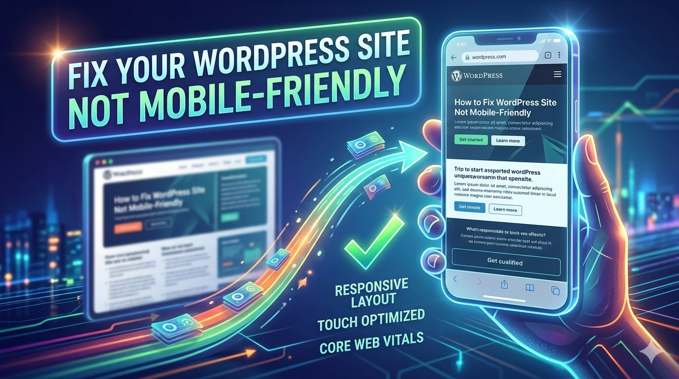
How to Fix WordPress Site Not Mobile-Friendly: The Complete Guide
In the modern digital era, mobile-first indexing is no longer a suggestion—it is the standard. If your website fails to provide a seamless experience on smartphones, you are essentially invisible to a massive portion of your audience. Learning how to fix WordPress site not mobile-friendly issues is critical for maintaining your search engine rankings and ensuring user satisfaction. When a site isn’t optimized for smaller screens, users bounce quickly, signaling to Google that your content might not be relevant. This guide will walk you through the technical and design steps necessary to transform your site into a mobile-responsive powerhouse.
1. Why Mobile-Friendliness is Non-Negotiable
Google primarily uses the mobile version of a site’s content for indexing and ranking. If your mobile experience is poor, your desktop rankings will likely suffer too. Beyond SEO, a mobile-friendly site builds trust. Users expect fast loading times, readable text, and clickable buttons without having to zoom in.
2. Test Your Current Mobile Status
Before making changes, you need to identify the specific problems. Use the following tools:
- Google Search Console: Check the “Mobile Usability” report to see specific errors like “text too small to read” or “clickable elements too close together”.
- PageSpeed Insights: This tool provides a mobile-specific score and tells you exactly what is slowing down your handheld experience.
3. Switch to a Responsive WordPress Theme
The most common reason for a site failing mobile tests is an outdated or poorly coded theme.
- What is Responsive Design? A responsive theme automatically adjusts its layout, images, and navigation to fit the screen size of the device being used.
- Minimalist Approach: Opt for themes that prioritize a minimalist design. These themes are often lighter, faster, and much easier to navigate on mobile devices.
- Avoid Bloat: Some premium themes come with too many features that slow down mobile rendering. Choose a theme optimized for “Core Web Vitals.”
4. Optimize Your Mobile Performance
Speed is a major factor in mobile usability. Mobile data connections can be less stable than desktop fiber, so your site needs to be lean.
- Image Optimization: Large image files are the #1 killer of mobile speed. Use WebP formats and ensure you optimize images for web performance by compressing them before upload.
- Implement Caching: Use plugins like WP Rocket or W3 Total Cache to serve static versions of your pages to mobile users.
- Minify Code: Minifying CSS and JavaScript removes unnecessary characters from your code, making files smaller and faster to download.
5. Improve Touch Elements and Readability
A site is only mobile-friendly if it is actually “friendly” to use with a thumb.
- Button Spacing: Ensure buttons and links are far enough apart so users don’t accidentally click the wrong thing.
- Font Size: Use a base font size of at least 16px. Anything smaller often triggers the “text too small to read” error in Google Search Console.
- No Pop-ups: Avoid aggressive interstitials or pop-ups that cover the entire screen on mobile. These are heavily penalized by Google.
6. Technical Fixes for Common Errors
Sometimes, the issue is a simple line of code.
- The Viewport Meta Tag: Ensure your theme’s
header.phpfile includes the viewport tag. This tells the browser how to adjust the page’s dimensions to the screen width. - Update WordPress and Plugins: Often, developers release updates specifically to improve mobile compatibility. Keeping your site updated is a baseline requirement.
- Fixing Specific Errors: If you encounter a 403 forbidden error in WordPress while testing mobile versions, it might be due to security plugins blocking certain mobile user agents; ensure your firewall settings are correctly configured.
7. Use Professional Resources
If you find that your current theme is beyond repair, it might be time for a redesign. High-quality resources like the WordPress Theme Directory offer thousands of mobile-ready options that have been vetted for code quality.
8. Final Checklist for a Mobile-Ready Site
To ensure you have successfully addressed the “fix WordPress site not mobile-friendly” goal, verify these points:
- Navigation is condensed into a “hamburger” menu.
- No horizontal scrolling is required to see content.
- Images scale automatically to fit the screen width.
- Forms are easy to fill out on a touchscreen.
Conclusion
Solving mobile usability issues is a continuous process. As devices evolve, your site must adapt. By focusing on responsive themes, fast loading times, and intuitive touch navigation, you protect your SEO and provide a better experience for your visitors.
helpful content for me…