Dirga Raj Lama
Web Developer
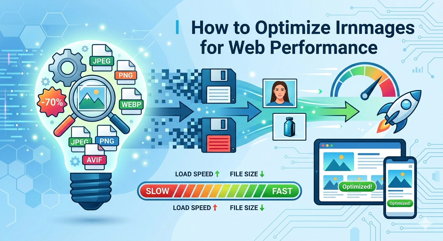
How to Optimize Images for Web Performance
In the modern digital landscape, user attention spans are shorter than ever, and page speed has become a non-negotiable ranking factor. If you want your website to rank on the first page of Google, you must understand how to optimize images for web performance without sacrificing visual quality. Images typically account for the largest portion of a webpage’s total payload, and unoptimized files are often the primary culprit behind slow-loading sites and poor Core Web Vitals (Request Metrics, 2025).
1. Choose the Right Image Formats (AVIF vs. WebP)
The first step in image optimization is selecting the correct file format. While JPEG and PNG were once the industry standards, 2026 has seen a definitive shift toward next-generation formats.
- AVIF: This is currently the gold standard for efficiency. AVIF images are typically 20–30% smaller than WebP and up to 50% smaller than JPEG at equivalent quality levels (Compresto, 2026). It is ideal for high-fidelity photography and complex gradients.
- WebP: With nearly 97% browser support, WebP remains a highly reliable “workhorse” format that offers excellent lossy and lossless compression (Elementor, 2026).
- SVG: For logos, icons, and simple geometric shapes, Scalable Vector Graphics (SVG) are essential. Since they are code-based, they scale infinitely without losing quality or increasing file size (NitroPack, n.d.).
2. Implement Smarter Compression Techniques
Compression is the process of reducing file size by removing unnecessary data. In 2026, the best practice is to use a combination of lossy and lossless compression. Lossy compression permanently removes some pixel data to achieve a significantly smaller file size, which is usually unnoticeable to the human eye if done correctly (Request Metrics, 2025).
To automate this, many developers utilize tools like TinyPNG or cloud-based CDNs that automatically serve the most compressed version of an image based on the visitor’s browser capabilities. Always aim for a balance where the image remains “sharp” but the file size stays below 100KB for standard web images.
3. Master Responsive Images with srcset
Serving a 2000-pixel wide hero image to a mobile user with a 400-pixel screen is a waste of bandwidth. To truly master how to optimize images for web performance, you must implement responsive images.
By using the srcset and sizes attributes in your HTML, you can provide the browser with a list of different image sizes. The browser then intelligently selects the most appropriate version to download based on the user’s device resolution (Google Search Central, n.d.). This prevents mobile devices from struggling with desktop-sized assets, drastically improving the Largest Contentful Paint (LCP).
4. Leverage Native Lazy Loading
Lazy loading is a strategy that instructs the browser to defer the loading of images that are not immediately visible in the viewport. Instead of loading every image on a long-form blog post at once, the browser only fetches them as the user scrolls down.
In 2026, native lazy loading is supported by over 95% of modern browsers (Mozilla, 2026). Simply adding the loading="lazy" attribute to your <img> tags can reduce initial page load times and save significant server resources. For critical “above-the-fold” images, however, you should avoid lazy loading and instead use fetchpriority="high" to ensure they appear as quickly as possible (Yotpo, 2026).
5. Essential Image SEO Checklist
Optimization isn’t just about speed; it’s about making sure search engines can understand your content.
- Descriptive Alt Text: Always include alt text for accessibility and SEO. Describe the image clearly without keyword stuffing (Fifteen Design, 2026).
- File Naming: Rename files from
IMG_123.jpgto descriptive, keyword-rich names likebest-trekking-gear-nepal.avif. - Image Sitemaps: For image-heavy sites, use an image sitemap to help Google discover and index all your visual assets (Google Search Central, n.d.).
Conclusion
Learning how to optimize images for web performance is an ongoing process of balancing quality and speed. By adopting AVIF as your primary format, implementing responsive srcset attributes, and utilizing native lazy loading, you can provide a seamless user experience that satisfies both human visitors and search engine crawlers.
For more advanced technical tips, check out our guide on WordPress Malware Removal or explore modern SEO strategies to grow your digital presence.